Here’s how to remove Search button on iPhone Home Screen on iOS 16
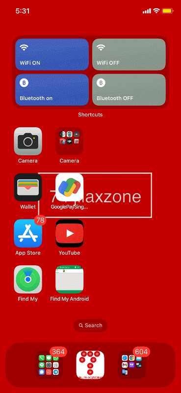
The new feature on iOS Home Screen, located below your app list and above the dock – it’s a Search button or Search bar or Search box, or whatever you may call it. But for easier reference in this article, allow me to use the term “Search button”.
iOS 16 brings so many improvements to the iPhone. However not all these improvements are actually good for everyone one. One of them is the new “Search” button located in your Home screen, in between your apps list and dock. If you happen to be like me who hate to see the “Search” button in between your apps list and dock, luckily there’s an easy way to remove the “Search” button in favor of the old paging dots icon. Check out the steps below to see how you can remove the “Search button” from your iOS Home Screen.

- This article shares the simple steps how you can get rid the Search button from your iOS Home Screen.
- Although this article is mentioning iPhone and iOS only, however the same steps work for iPad and iPadOS.
- For other interesting articles, head to: iOS Tips & Tricks, Games, FREE games & stuffs, how-to and more at JILAXZONE.
- If you find this article / content inside is already obsolete, do let me know by commenting on the comment section below so that I can update the article to reflect the latest process/news. Thanks.
Here’s how you can easily remove Search button on iPhone Home Screen on iOS 16
Follow these simple 2-steps to remove the Search button from your iPhone Home Screen once and for all.
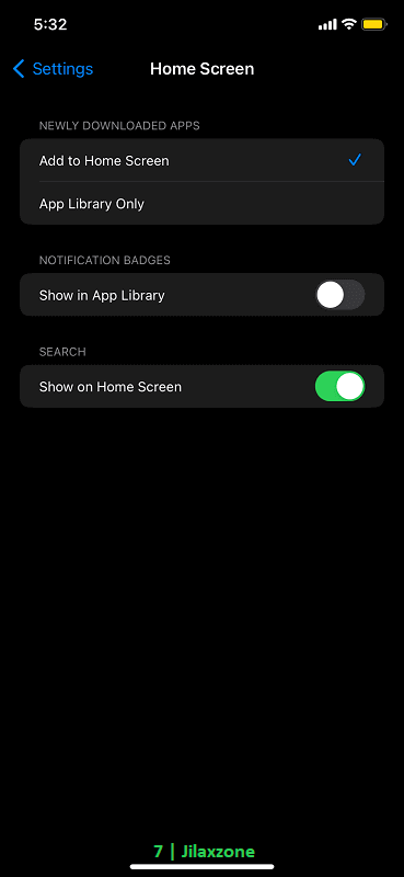
1) On your iPhone, go to Settings > Home Screen.

2) Inside Home Screen page, under “SEARCH”, turn off “Show on Home Screen”.
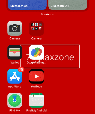
That’s it. Go back to your Home Screen now, you should no longer see the Search button.
Does disabling search from Home Screen will make you unable to do search on your iPhone?
Short answer: No. Turning off “Show on Home Screen” under “SEARCH” is just disabling the search button from your Home screen. You can still search even without the Search button, simply by swiping down from anywhere on the iPhone screen.
Bring it all together
With the simple tip shared above, if you are like me – hate to see the new “Search” button located in between apps list and dock – now you can simply get rid of it. In case you have queries or are facing difficulties, don’t hesitate to put your issues or thoughts down below on the comment section. I’ll be happy to assist!

Interested to see other iPhone and iOS tips and tricks? Check them out here: iPhone and iOS tips and tricks at JILAXZONE.

